Best 9 Web Design Trends To Stay Afloat in 2022 and Beyond
Web design trends are transient. In only a few years, those features and design elements that were once all the rage are now cliched and tired. Similarly, the average human attention span has dwindled to a negligible 8.25 seconds. So, it takes a lot not to lose conversions or accumulate bounce rates these days. Put simply, if you fail to evolve with the emerging trends, your website is definitely treading a path of extinction.
A smooth user interface, seamless user experience, and sleek and modern web design – these are things clients want to see. If your website aligns with recent trends, you’ll be better positioned as a trustworthy “plug” for relevant services. Conversely, they’ll probably leave your website for direct competitors. Since web design accounts for website credibility for almost 95% of people in the digital space, it becomes even more necessary to immerse yourself in these trends.
So, to help you stay thrive in this ever-competitive sphere, this article covers 9 of the emerging web design trends.
[ez-toc]
Actual human images
It’s time to keep those images real and give models and professionals a rest. When it comes to beauty, there is no one size fits all. In fact, its ideals evolve almost every now and then. Drawing its motivation from historical, cultural, and societal influences, the 2022 standard for beauty emphasizes diversity and inclusivity. This is, of course, not limited to web design. More and more brands now explore images that compel different ages, backgrounds, and races. In essence, it is the new normal.
If you want to introduce a sense of normalcy to your website while appealing to almost everyone, the emerging web design trends of high-quality pictures that cut across diverse walks of life, ethnicity, races, body types, etc., offer a great way to achieve that.
Using real images prospects can relate with, is especially a smart decision for eCommerce websites. This allows potential customers to imagine themselves using the advertised product, ultimately compelling them to make a purchase.
Grainy gradients
Gradients are already all the rage. In fact, everyone is probably tired of it and that’s expected. But if you want to introduce a new perspective/effect, designers in 2022 now add grains. When used rightly, a typical gradient is modern, glowy, futuristic, and sleek.
But if you need more texture and natural feel, graining it fits your bill perfectly. Depending on the mood you’re looking to set, grain can imitate an analogy film, silk-screened poster, and other natural textures you like.
You may use grainy gradients selectively, throughout the entire page, with particular elements or as the background. It works just as well for animated graphic design, button borders, and countless elements.
Gender neutrality
Landing pages that initially embraced this idea were deemed just being thoughtful. But today it seems to be the standard. Creating a web design that transcends societal assumptions is key to making landing pages accessible and appealing to all.
For example, overtly masculine components like skulls and flames don’t have to be the hero of the website to appeal to largely male audiences. In a nutshell, the latest web design trends emphasize the design team shunning assumptions about the website visitors and their gender.
Besides, it’s now becoming increasingly popular to make various gender pronouns and options available in dropdowns and forms. Similarly, more eCommerce websites are buying into this gender inclusivity trend by not categorizing items, such as clothing, by gender.
Interactivity
Your traffic, and bounce rates, among other metrics, rely heavily on what value you provide for the website visitors. And to a great extent, including an interactive section in your web design can be key to getting the best out of these metrics.
For instance, if the web design focuses on real estate, interactive elements such as financial calculators, surveys, and assessments, are terrific value-oriented trends to include.
Besides these elements, some designers now adopt several creative ways to get their texts moving according to some gestures from the user’s mouse. This is the interactive font trend. If you want to tread the easy path, use a hover-state change as you’d normally do with a button.
You can as well create these effects with tons of no-code tools as opposed to what is available a few years ago. Remember, when creating interactive texts, it is important not to overdo and keep everything as legible as possible.
Still on interactivity, responsible motion design is another trend 2022 web designs are actively exploring. It’s fast becoming the standard, in fact, although movement upscales web design appeal, it is easy to go overboard, ultimately affecting website visitors by leaving them with motion sickness. Hence, the motion should not be all over the place and should be used subtly and responsibly.
One-page website
When it comes to web design, less is indeed more. Simplicity is key and in most cases, the least complex is usually the most compelling. One-page websites accentuate this concept and they are fast becoming a trend in 2022.
Typically, these websites feature a straightforward UX design and scroll navigation at the expense of internal navigation and menus. In most cases, they usually direct website visitors to another website.
This trend best applies to cases where the design concept is relatively narrow, such as a portfolio design, and can simultaneously serve as an effortless link to get audiences to a specific destination in an experience devoid of needle searches or distractions.
The one-page design trend has as well propelled more designers to optimize their creative flow and create compelling outputs. The idea emphasizes content structure consistency to guarantee that visitors will not get lost navigating tons of distracting elements. So, if you’re looking for the best way to focus on the most important elements, this is your guy.
To further optimize the one-page website, scrollytelling or narrative visualization is yet another trend to watch out for. It offers a great way to tell interactive stories on the website via animations, texts, and other interactive elements.
Simple & impeccable design
Web design trends for 2022 are essentially pushing the notion of maximalist to the side. The demand for more reached an all-time high in 2021, and it has been on a downtrend since then. We now accentuate minimalist design features introducing more delicacy to visual weights. Still, this minimalistic demand is not 100% minimalism.
It emphasizes more dynamism with a blend of sleekness and very clean designs. Everything from the hero sections, to other supporting elements, are more defined, refined, less populated, and all working together to offer a smooth user experience.
Flat design or minimalism has always been one of the top web design trends. But in 2022, it’s taking a step away from the black and white lens we’ve always viewed it in. We get to see the minimalistic notion embodying different color schemes, I.e. colorful minimalism, with every page featuring bolder colors, cleaner fonts like serif fonts, and of course, less-is-more design elements. This help creates an attention-gripping page without doing too much as well.
Merging the re-emerging brutalist style + Minimalism
The brutalist design has its origin from classical brutalism. In essence, this is an architectural notion in the last few decades, featuring the use of exposed and raw materials, including concrete, among others.
The movement came back to light in 2014, and since then, its popularity has been spreading like wildfire. Digital brutalism emphasizes the use of elements such as flat/plain backgrounds, default device fonts, asymmetrical layouts, and unedited photographs, among others. The design is as raw as it gets.
Digital brutalism is typically well focused and sharply defined coupled with a gripping effect, considering the honest and raw feel it embodies.
Moving forward, 2022 web designers as well blend the rawness of this style with minimalism, which makes it perfect for less avant-garde audiences. Besides, this combination makes it easier to steer clear of what initially resulted in the downfall of the original brutalist style decades ago.
Chatbots in more extensive uses
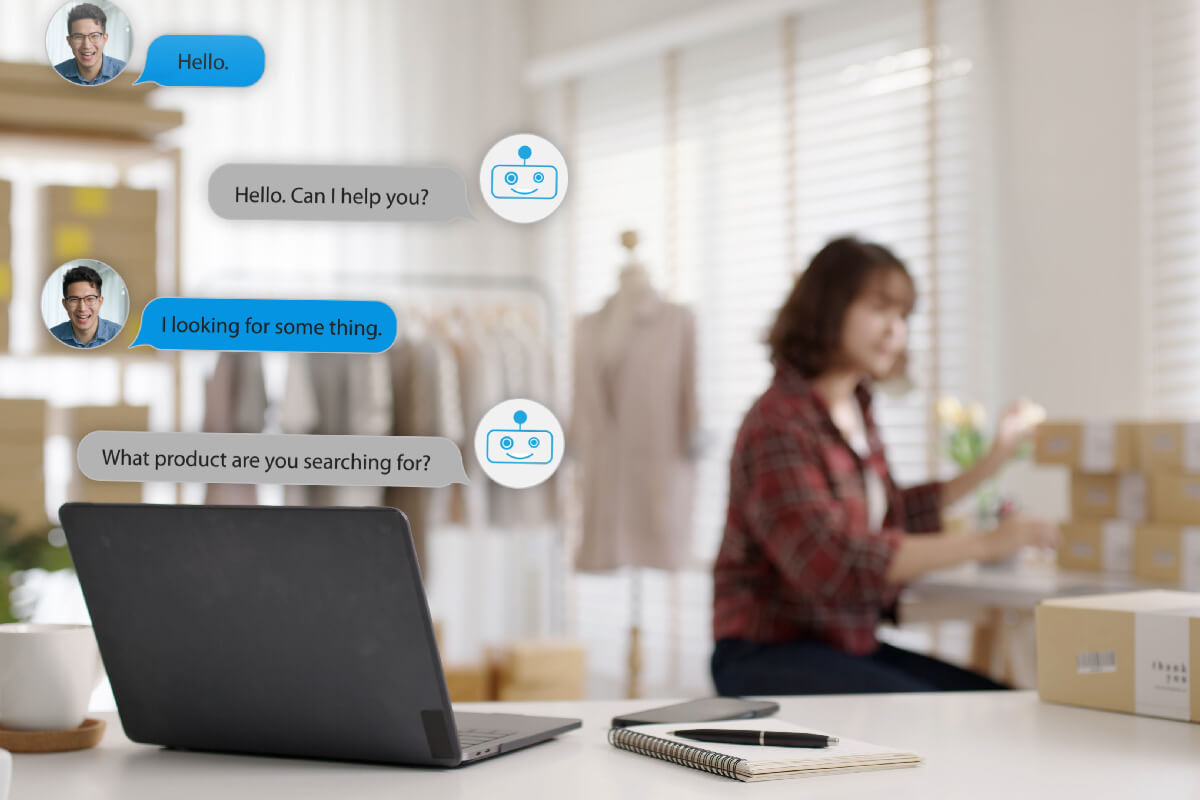
Chatbots are one of those web design trends that have been around for a minute. And without a doubt, its relevance will transcend 2022. As AI and deep learning keep developing, chatbots are better positioned to become the standard for basic customer services as well as personal shopping intents.
For instance, when a client opens your website in a bid to access on-phone support for the latest product upgrade. If the chatbot knows about this upgrade, it can inform them and cater to their concerns even without talking to anyone on phone.
This, of course, will result in more positive reviews, and optimized and flexible experiences, while saving considerable costs. Especially if you run an eCommerce business, this is a trend you don’t want to miss.
3D graphics & Augmented reality
3D doesn’t seem to be losing pace in the web design sphere. Its relevance spans several years ago, and as it stands, it’ll transcend more years to come. It offers a terrific approach to streamlining interfaces and includes attention-grabbing elements to the overall design.
From professional portfolios to personal websites, you can never go wrong with 3D. Whether you want colorful or bright elements or perhaps, very realistic designs, it has what it takes to add depth to your design and making it pop.
3D designs also offer seamless penetration into the augmented reality space, allowing web designers to create a bridge between VR and reality. Particularly for eCommerce websites, prospects and customers can now see how a product will potentially look on them before purchase.
Table of Contents
Share on
Best 9 Web Design Trends To Stay Afloat in 2022 and Beyond
Web design trends are transient. In only a few years, those features and design elements that were once all the rage are now cliched and tired. Similarly, the average human attention span has dwindled to a negligible 8.25 seconds. So, it takes a lot not to lose conversions or accumulate bounce rates these days. Put simply, if you fail to evolve with the emerging trends, your website is definitely treading a path of extinction.
A smooth user interface, seamless user experience, and sleek and modern web design – these are things clients want to see. If your website aligns with recent trends, you’ll be better positioned as a trustworthy “plug” for relevant services. Conversely, they’ll probably leave your website for direct competitors. Since web design accounts for website credibility for almost 95% of people in the digital space, it becomes even more necessary to immerse yourself in these trends.
So, to help you stay thrive in this ever-competitive sphere, this article covers 9 of the emerging web design trends.
[ez-toc]
Actual human images
It’s time to keep those images real and give models and professionals a rest. When it comes to beauty, there is no one size fits all. In fact, its ideals evolve almost every now and then. Drawing its motivation from historical, cultural, and societal influences, the 2022 standard for beauty emphasizes diversity and inclusivity. This is, of course, not limited to web design. More and more brands now explore images that compel different ages, backgrounds, and races. In essence, it is the new normal.
If you want to introduce a sense of normalcy to your website while appealing to almost everyone, the emerging web design trends of high-quality pictures that cut across diverse walks of life, ethnicity, races, body types, etc., offer a great way to achieve that.
Using real images prospects can relate with, is especially a smart decision for eCommerce websites. This allows potential customers to imagine themselves using the advertised product, ultimately compelling them to make a purchase.
Grainy gradients
Gradients are already all the rage. In fact, everyone is probably tired of it and that’s expected. But if you want to introduce a new perspective/effect, designers in 2022 now add grains. When used rightly, a typical gradient is modern, glowy, futuristic, and sleek.
But if you need more texture and natural feel, graining it fits your bill perfectly. Depending on the mood you’re looking to set, grain can imitate an analogy film, silk-screened poster, and other natural textures you like.
You may use grainy gradients selectively, throughout the entire page, with particular elements or as the background. It works just as well for animated graphic design, button borders, and countless elements.
Gender neutrality
Landing pages that initially embraced this idea were deemed just being thoughtful. But today it seems to be the standard. Creating a web design that transcends societal assumptions is key to making landing pages accessible and appealing to all.
For example, overtly masculine components like skulls and flames don’t have to be the hero of the website to appeal to largely male audiences. In a nutshell, the latest web design trends emphasize the design team shunning assumptions about the website visitors and their gender.
Besides, it’s now becoming increasingly popular to make various gender pronouns and options available in dropdowns and forms. Similarly, more eCommerce websites are buying into this gender inclusivity trend by not categorizing items, such as clothing, by gender.
Interactivity
Your traffic, and bounce rates, among other metrics, rely heavily on what value you provide for the website visitors. And to a great extent, including an interactive section in your web design can be key to getting the best out of these metrics.
For instance, if the web design focuses on real estate, interactive elements such as financial calculators, surveys, and assessments, are terrific value-oriented trends to include.
Besides these elements, some designers now adopt several creative ways to get their texts moving according to some gestures from the user’s mouse. This is the interactive font trend. If you want to tread the easy path, use a hover-state change as you’d normally do with a button.
You can as well create these effects with tons of no-code tools as opposed to what is available a few years ago. Remember, when creating interactive texts, it is important not to overdo and keep everything as legible as possible.
Still on interactivity, responsible motion design is another trend 2022 web designs are actively exploring. It’s fast becoming the standard, in fact, although movement upscales web design appeal, it is easy to go overboard, ultimately affecting website visitors by leaving them with motion sickness. Hence, the motion should not be all over the place and should be used subtly and responsibly.
One-page website
When it comes to web design, less is indeed more. Simplicity is key and in most cases, the least complex is usually the most compelling. One-page websites accentuate this concept and they are fast becoming a trend in 2022.
Typically, these websites feature a straightforward UX design and scroll navigation at the expense of internal navigation and menus. In most cases, they usually direct website visitors to another website.
This trend best applies to cases where the design concept is relatively narrow, such as a portfolio design, and can simultaneously serve as an effortless link to get audiences to a specific destination in an experience devoid of needle searches or distractions.
The one-page design trend has as well propelled more designers to optimize their creative flow and create compelling outputs. The idea emphasizes content structure consistency to guarantee that visitors will not get lost navigating tons of distracting elements. So, if you’re looking for the best way to focus on the most important elements, this is your guy.
To further optimize the one-page website, scrollytelling or narrative visualization is yet another trend to watch out for. It offers a great way to tell interactive stories on the website via animations, texts, and other interactive elements.
Simple & impeccable design
Web design trends for 2022 are essentially pushing the notion of maximalist to the side. The demand for more reached an all-time high in 2021, and it has been on a downtrend since then. We now accentuate minimalist design features introducing more delicacy to visual weights. Still, this minimalistic demand is not 100% minimalism.
It emphasizes more dynamism with a blend of sleekness and very clean designs. Everything from the hero sections, to other supporting elements, are more defined, refined, less populated, and all working together to offer a smooth user experience.
Flat design or minimalism has always been one of the top web design trends. But in 2022, it’s taking a step away from the black and white lens we’ve always viewed it in. We get to see the minimalistic notion embodying different color schemes, I.e. colorful minimalism, with every page featuring bolder colors, cleaner fonts like serif fonts, and of course, less-is-more design elements. This help creates an attention-gripping page without doing too much as well.
Merging the re-emerging brutalist style + Minimalism
The brutalist design has its origin from classical brutalism. In essence, this is an architectural notion in the last few decades, featuring the use of exposed and raw materials, including concrete, among others.
The movement came back to light in 2014, and since then, its popularity has been spreading like wildfire. Digital brutalism emphasizes the use of elements such as flat/plain backgrounds, default device fonts, asymmetrical layouts, and unedited photographs, among others. The design is as raw as it gets.
Digital brutalism is typically well focused and sharply defined coupled with a gripping effect, considering the honest and raw feel it embodies.
Moving forward, 2022 web designers as well blend the rawness of this style with minimalism, which makes it perfect for less avant-garde audiences. Besides, this combination makes it easier to steer clear of what initially resulted in the downfall of the original brutalist style decades ago.

Chatbots in more extensive uses
Chatbots are one of those web design trends that have been around for a minute. And without a doubt, its relevance will transcend 2022. As AI and deep learning keep developing, chatbots are better positioned to become the standard for basic customer services as well as personal shopping intents.
For instance, when a client opens your website in a bid to access on-phone support for the latest product upgrade. If the chatbot knows about this upgrade, it can inform them and cater to their concerns even without talking to anyone on phone.
This, of course, will result in more positive reviews, and optimized and flexible experiences, while saving considerable costs. Especially if you run an eCommerce business, this is a trend you don’t want to miss.
3D graphics & Augmented reality
3D doesn’t seem to be losing pace in the web design sphere. Its relevance spans several years ago, and as it stands, it’ll transcend more years to come. It offers a terrific approach to streamlining interfaces and includes attention-grabbing elements to the overall design.
From professional portfolios to personal websites, you can never go wrong with 3D. Whether you want colorful or bright elements or perhaps, very realistic designs, it has what it takes to add depth to your design and making it pop.
3D designs also offer seamless penetration into the augmented reality space, allowing web designers to create a bridge between VR and reality. Particularly for eCommerce websites, prospects and customers can now see how a product will potentially look on them before purchase.

